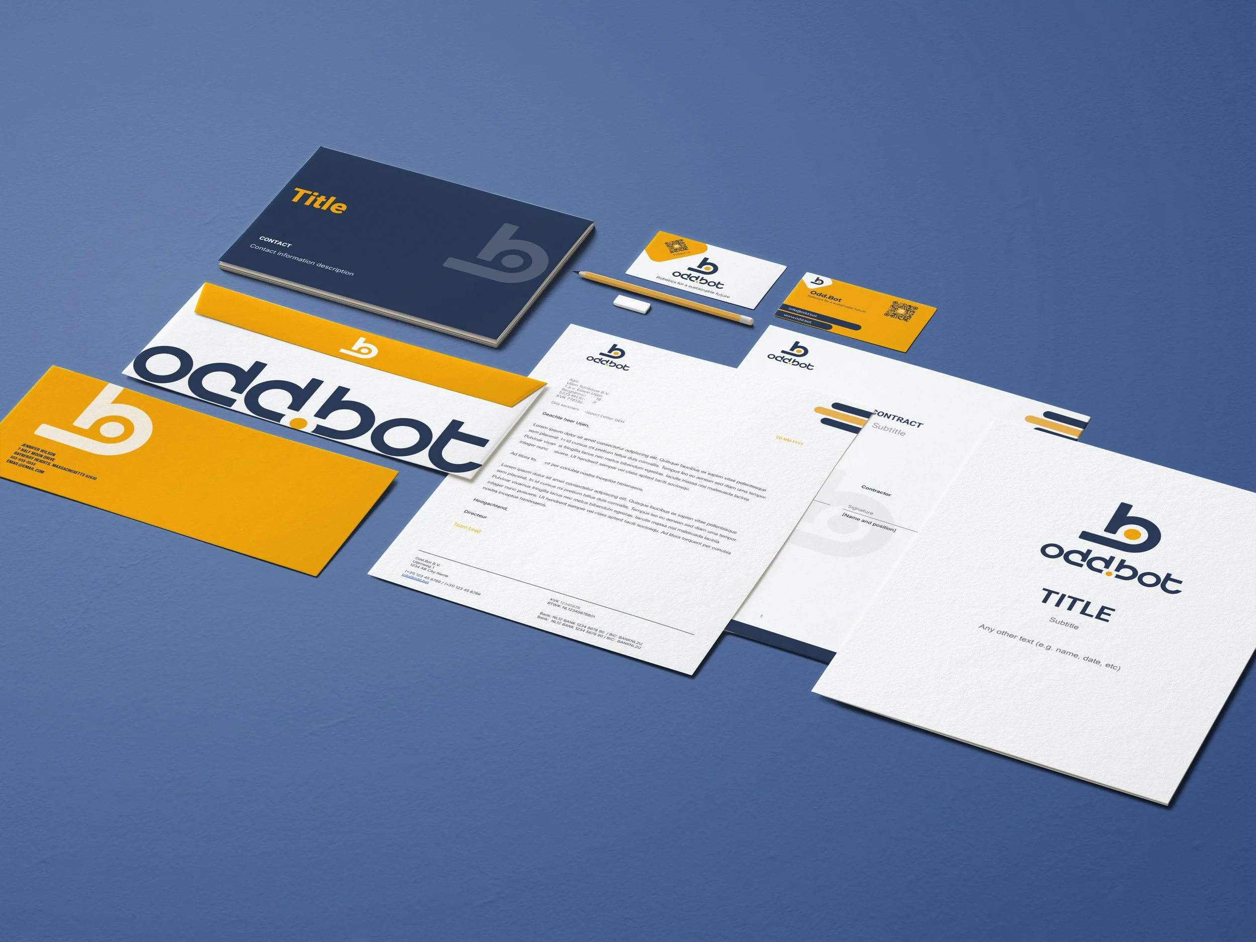
Odd.bot: branding
The branding project for Odd.Bot established a unified visual system rooted in UX principles: ensuring clarity, consistency, and ease of implementation across teams.
Timeline
2023-2024
Client
Odd.Bot
Role
UX & Brand DesignerDesign challenge
unify the branding across diverse platforms
Odd.Bot was facing a fragmented brand presence
The logos were inconsistently used across products, templates lacked visual cohesion, and internal teams had no clear design guidelines. As the product suite expanded, this lack of structure may create friction in UX, dilute brand trust, and make scaling UI assets inefficient.
project overview

The project was driven by two strategic UX and brand goals:
Clarity in Visual Components: Re-establish visual hierarchy and accessible colour/tone choices
Consistency Across Touchpoints: Design a brand system that scales across digital and print assets without ambiguity
Efficiency for Product Teams: Create reusable, systematised assets and guidelines to support fast iteration and design scalability
Final Design
branding with details
The deliverables varied from the revised logo, the choice of colour palettes/fonts, and templates for a range of documentations.
Key Characteristics
Modular Logo System
Designed to be flexible across screen sizes and contexts: from full logo to glyph-only, monochrome, and dark mode glow variants. This facilitates using in apps, footers, slide decks, and onboarding flows without sacrificing recognition.
Accessible, UX-Aligned Color Palette
Built to meet contrast ratios and semantic use cases (e.g. alerts, CTAs, UI states). Colours were chosen not only for aesthetics but for function and psychological tone.
Typography System for Clarity & Scale
Roboto Bold provides structure for headings; Inter handles dense UI copy with strong readability. A consistent scaling factor (3x) ensures clear hierarchy and fast scannability, especially in responsive environments.
Component-Friendly Shapes & Layout Rules
Created assets with defined spacing logic (e.g., triple-gap rhythm, doubling size pattern) for seamless inclusion in design systems or frontend component libraries.


