Miles
Long COVID presents persistent challenges for individuals struggling with energy regulation and recovery. This project ‘Miles: Post-COVID’ aimed to provide adaptive support for people with long COVID.
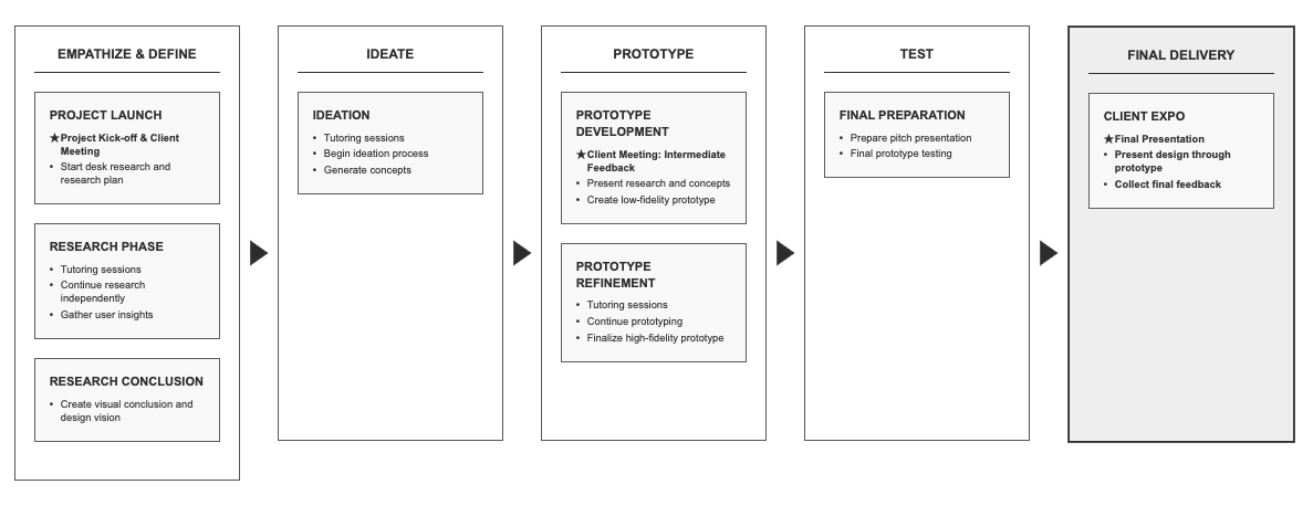
Timeline
04.2025 - 07.2025
Client
Stichting Bestaanskracht
Role
Lecturer Context
What is ‘Miles’?
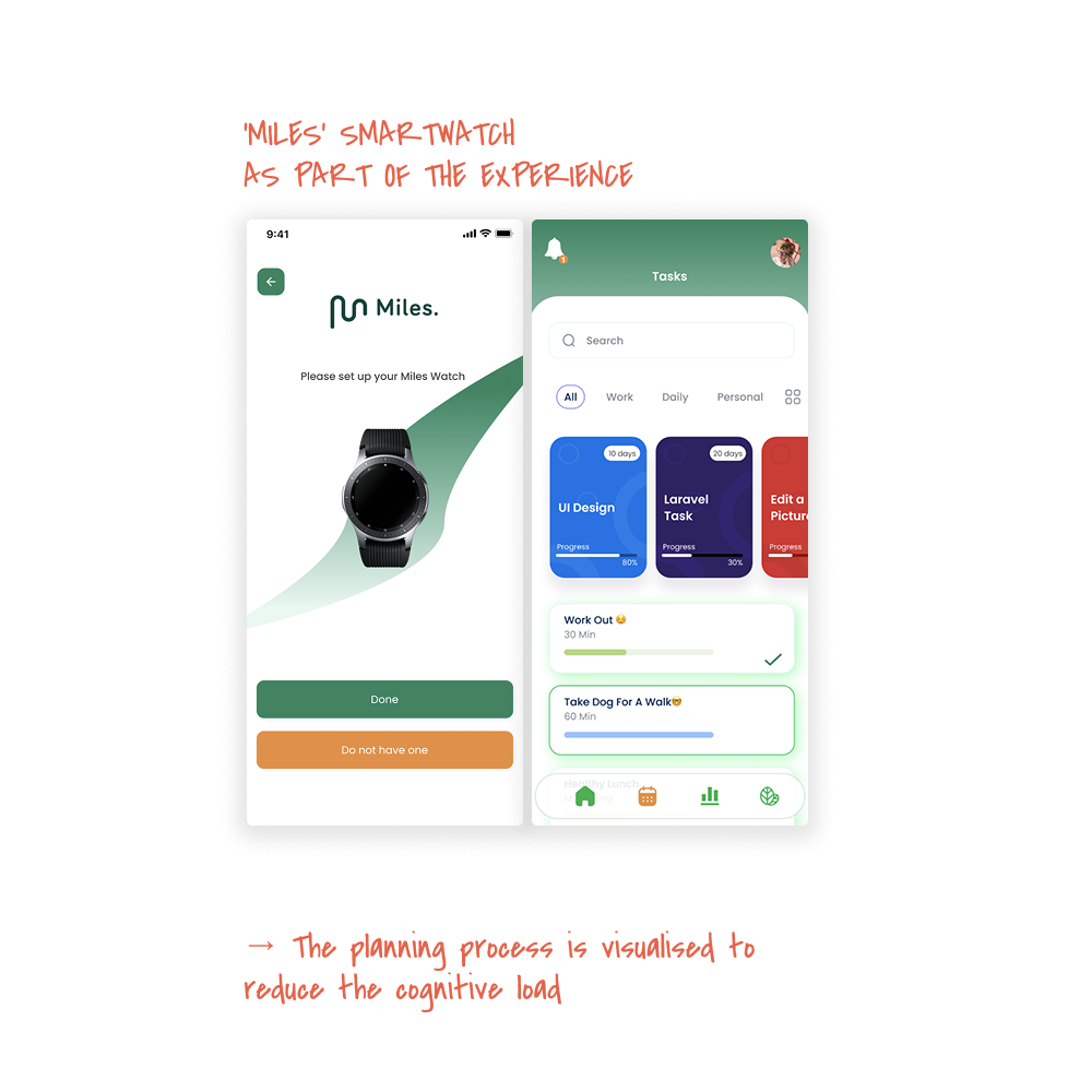
Post-COVID was developed in collaboration with Stichting Bestaanskracht to explore how a customisable digital tool (virtual assistant on smartwatch/app) could support recovery journeys that are often unpredictable and non-linear.
Long COVID presents persistent challenges for individuals struggling with energy regulation, cognitive fatigue, and emotional instability.
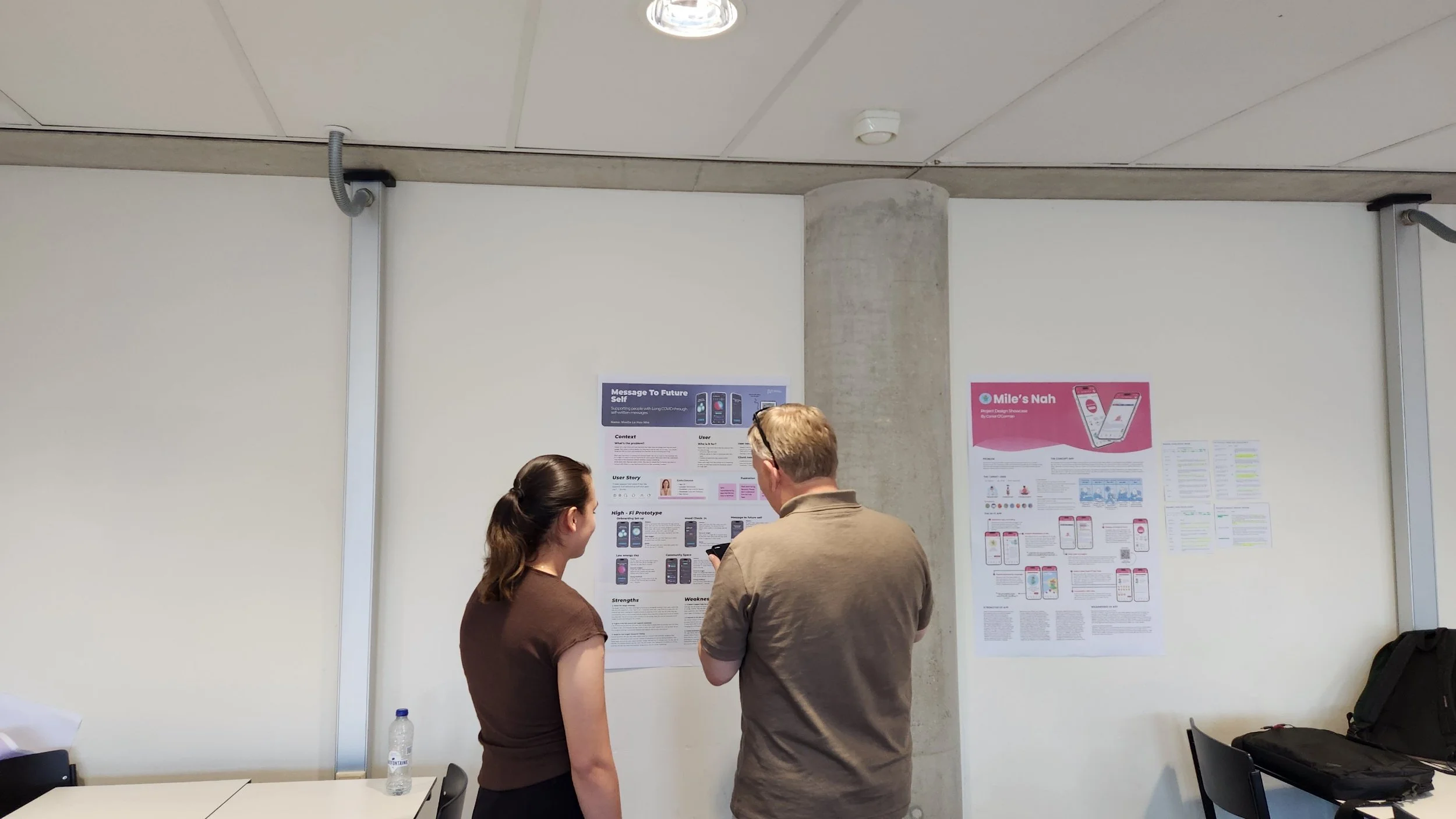
Over a 3-month educational collaboration, 13 first-year UX Design students at The Hague University of Applied Sciences designed adaptive recovery tools while maintaining close contact with target users.
As Lecturer, I guided the overall design process and introduced the use of a Retrieval Augmented Generation (RAG) model to support research and design exploration.
Problem Definition
Background
Existing recovery apps are often designed around fixed routines and predictable progress, which do not align with the fluctuating realities of long COVID.
Target users frequently experience:
severe fatigue
cognitive overload
emotional instability
changing daily capacity
Key Observations
Early user research and synthesis revealed:
unstable energy patterns create anxiety and guilt
flexible planning supports autonomy
emotional well-being is closely tied to identity and social validation
cognitive clarity requires simplicity
shared tools strengthen caregiver-patient relationships
subtle feedback loops are critical for sustainable use
Additionally, participant recruitment challenges limited access to users during later testing phases, requiring alternative research support.
core problem
How might we design adaptive and emotionally supportive recovery tools that respect fluctuating energy levels while maintaining clarity, autonomy, and usability?
OKRs & Hypothesis
Objectives
Deliver diverse design directions balancing emotional care and functional structure.
Explore how AI-supported research methods can enhance early design phases.
Key Results
Deliver 10+ student-designed tools addressing different recovery needs
As a lecturer, I aimed to deliver diverse outputs, while keeping the students engaged throughout the course.
Guide each student to execute 2+ research activities with Long COVID patients
Although the project period was limited, I aimed to guide the students to actively recruit the participants, with the support of the client.
Integrate RAG-supported research methods to compensate for limited user access during testing
The RAG model was provided by the client. It was my role to encourage the students to get familiar with the tool through hands-on experiences, while keeping them to stay critical in using AI in the design process.
I hypothesised that:
Hypothesis 1
design
If recovery tools prioritise flexibility and emotional validation, users will feel more supported and lessoverwhelmed.
Hypothesis 2
process
If students combine direct research with AI-supported synthesis, they can maintain design depth despite recruitment limitations.
Hypothesis 3
Interaction
If interfaces reduce cognitive load and promote gentle pacing, users will experience greater autonomy during recovery.
Approach
My role extended beyond teaching design tools.
I focused on:
guiding students toward gentle pacing and emotionally sensitive design
coaching tone, interaction calmness, and invisible symptom design
introducing RAG model usage to support research and ideation
balancing UX rigour with empathy-focused design coaching
Key Strategic Emphasis
Designing for energy limitations requires listening and adaptation rather than problem-solving alone.
process
During the research phase, students conducted:
semi-structured interviews (avg. n ≈ 1 per student)
surveys and self-report diaries
user journey mapping focused on fatigue patterns
emotional touchpoint analysis
card sorting and pattern recognition workshops
→ Total: 90+ synthesised insights across 13 students
AI-Supported Research Integration
To support the research, the RAG model was introduced to:
simulate user perspectives
access prior quotes and contextual data
support journey mapping and testing scenarios
→ This allowed students to explore alternative viewpoints while maintaining user-centred thinking.
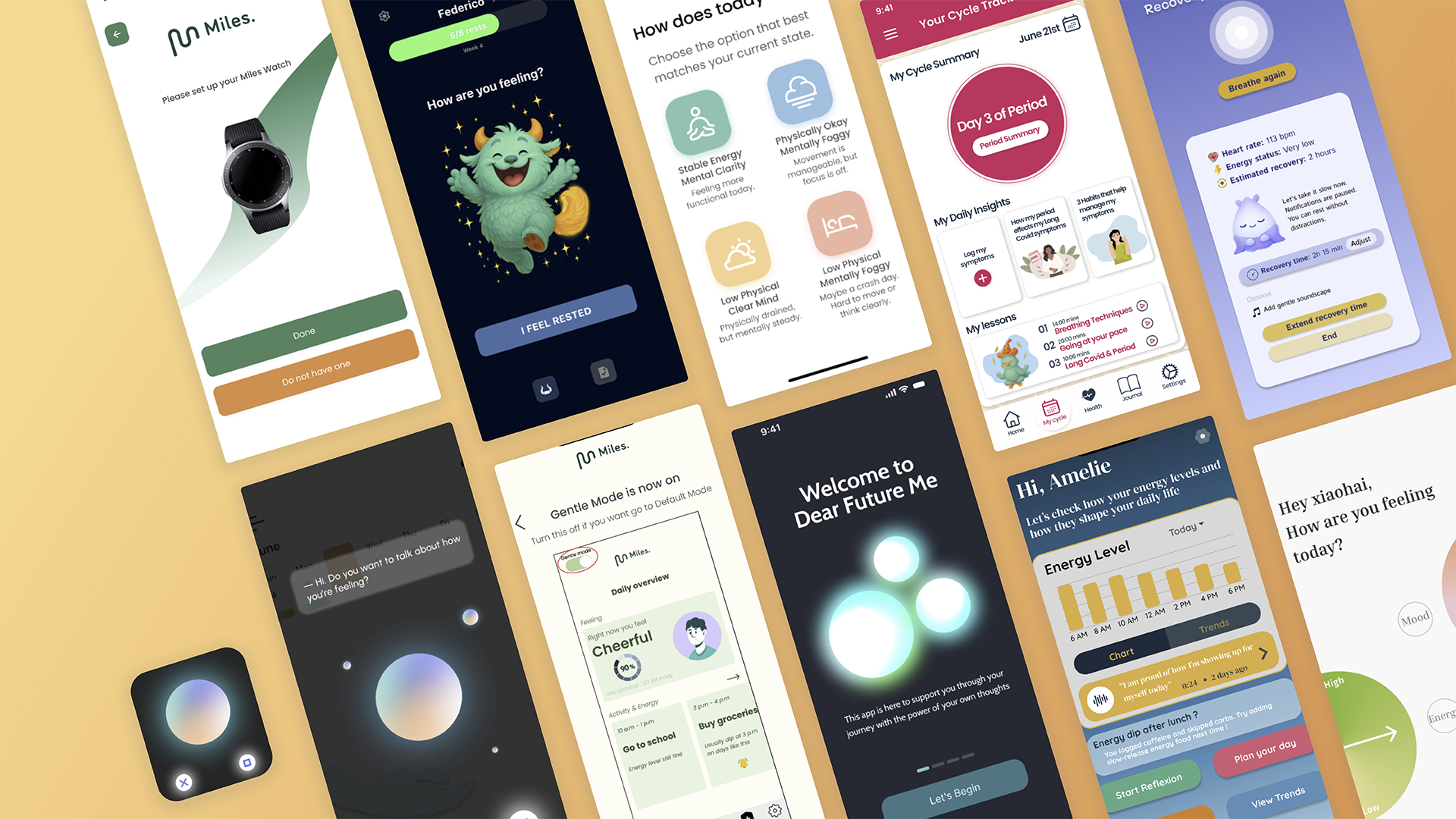
Overview: Design Directions
Results
Results suggest:
strong alignment between student outcomes and user insights
high appreciation for diversity of concepts
increased exploration of emotionally sensitive UX patterns
Key insight from students:
Designing for energy limits is about listening more than solving.
8/10
client satisfaction
13 final design outcomes
emerged in 2 directions
direction 1
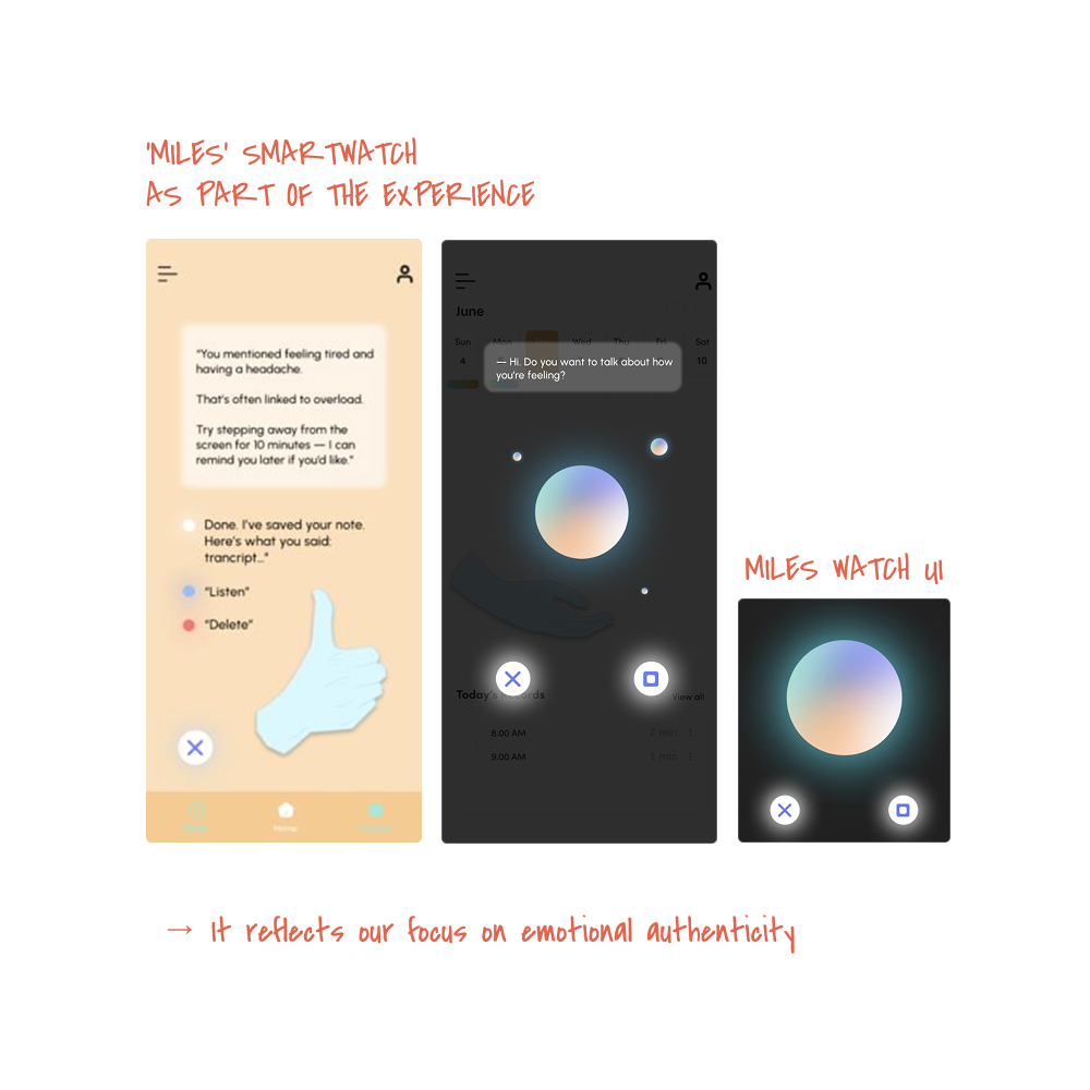
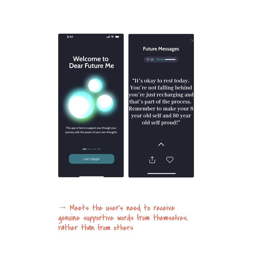
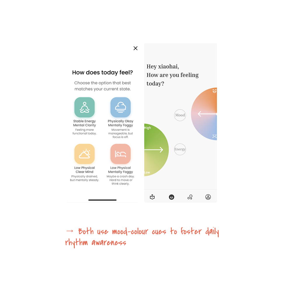
Emotion-Driven Care & Expressive Design
Overall:
journaling and reflective prompts
mood-responsive interactions
emotional metaphors and companion systems
Focus:
identity rebuilding
emotional validation
self-expression during recovery
direction 2
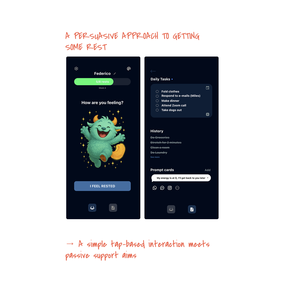
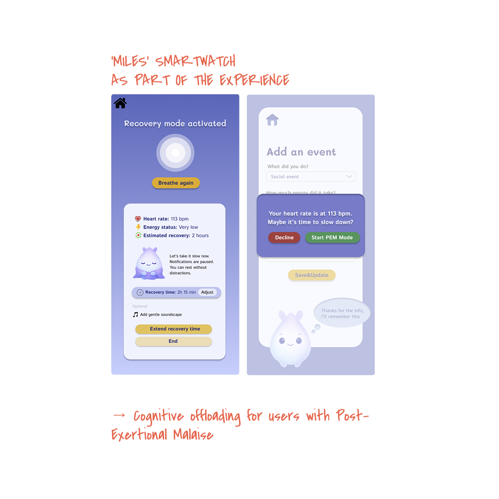
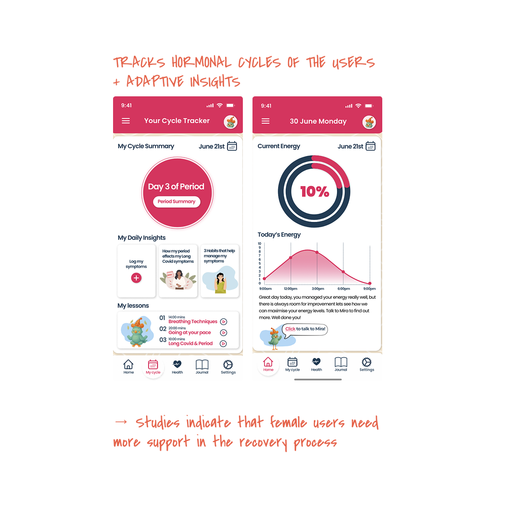
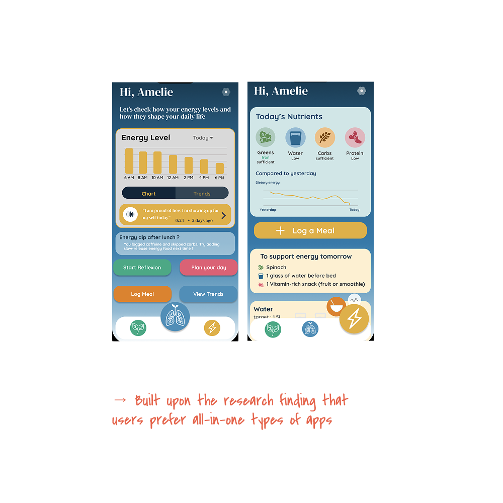
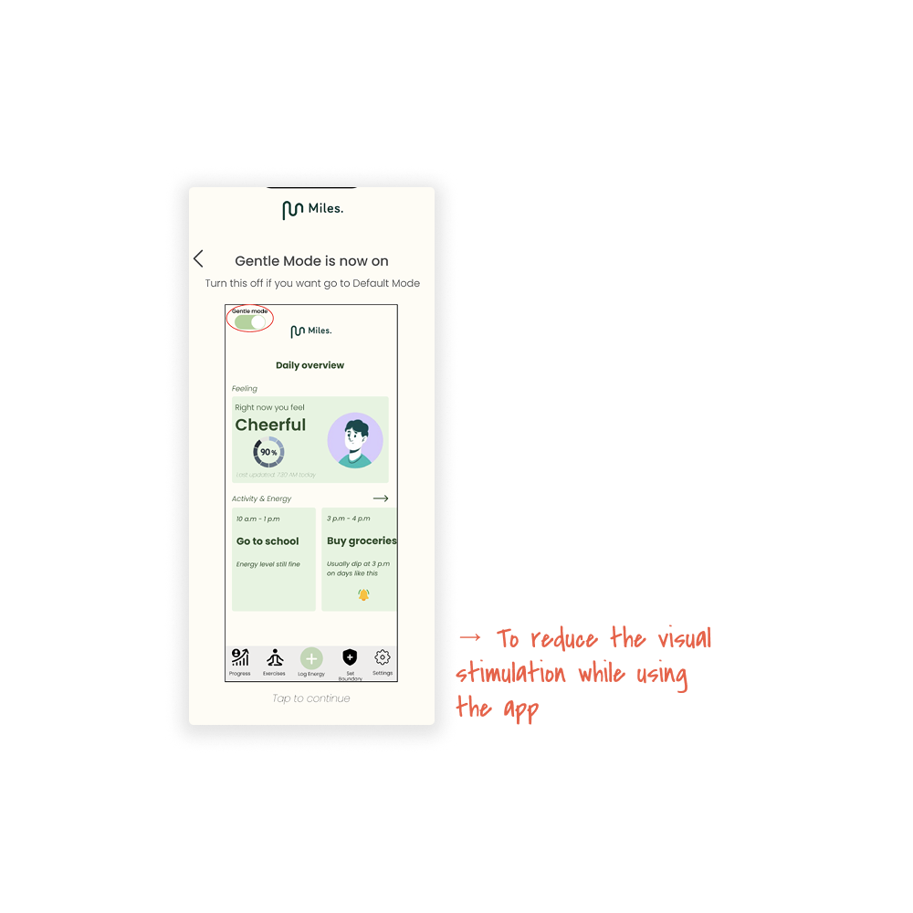
Data-Aided Agency & Cognitive Relief
Overall:
pacing planners and energy scheduling
visual summaries
low-input structured tools
Focus:
cognitive offloading
simplicity
daily routine support
Reflection
This project highlighted the growing intersection between empathy-driven design and AI-supported workflows.
As a lecturer:
guiding emotional tone required balancing structure with flexibility
students needed explicit coaching on how to communicate effectively with AI tools
RAG integration proved efficient for synthesis but raised questions about validity within user-centred design
Key learnings
user involvement should be strengthened during evaluation phases
lightweight validation methods can reduce participant burden
emotional design must connect to concrete daily routines to remain practical
Most importantly:
Designing for vulnerable users means prioritising calmness, adaptability, and respect for invisible limitations.